Building Your Ad Revenue Calculator: Metrics, Formulas & Dashboards
As Game Monetization becomes increasingly complex, having real-time visibility into your ad revenue performance is no longer optional—it’s essential. Whether you’re running rewarded video ads, interstitials, or banner campaigns, understanding the metrics that drive your revenue can mean the difference between scaling successfully and leaving money on the table.
At AppLixir, we’ve seen firsthand how publishers who actively monitor and optimize their ad performance consistently outperform those who rely on guesswork. That’s why we’re walking you through building your own comprehensive ad revenue calculator and reporting dashboard. By the end of this guide, you’ll have a live system that transforms raw ad data into actionable insights.
Contents
- 1 Why Build Your Own Ad Revenue Calculator?
- 2 Core Ad Revenue Metrics: The Foundation
- 3 Essential Formulas for Revenue Calculation
- 4 Building Your Live Calculator: Data Sources
- 5 Dashboard Design: Turning Data into Insights
- 6 Implementation Best Practices
- 7 Advanced Features for Power Users
- 8 Measuring Success and Iteration
- 9 AppLixir Rewarded Video Ads
Why Build Your Own Ad Revenue Calculator?
Most ad networks provide basic reporting, but they often fall short when you need to:
- Compare performance across multiple networks and ad formats
- Calculate projected revenue based on user growth scenarios
- Identify optimization opportunities in real-time
- Make data-driven decisions about ad placement and frequency
A custom calculator gives you complete control over your metrics, enabling deeper analysis and more strategic decision-making.
Core Ad Revenue Metrics: The Foundation
Before diving into formulas, let’s establish the key performance indicators that form the backbone of any ad revenue system:
Impressions represent the total number of times ads are displayed to users. This is your volume metric—the raw fuel that powers everything else. However, not all impressions are created equal, and understanding impression quality is crucial for accurate revenue projections.
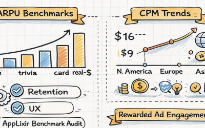
Fill Rate measures the percentage of ad requests that successfully return an ad. This metric directly impacts your potential revenue ceiling. A 100% fill rate means every ad request generates an impression, while lower rates indicate missed monetization opportunities. Industry benchmarks typically range from 85-95% for premium inventory.
Click-Through Rate (CTR) calculates the percentage of impressions that result in user clicks. While not all ad formats rely on clicks for revenue (particularly rewarded video), CTR remains a critical engagement indicator that affects eCPM rates and advertiser demand.
Effective Cost Per Mille (eCPM) represents your actual earnings per 1,000 impressions. This metric consolidates various pricing models (CPC, CPV, CPA) into a standardized comparison point, making it invaluable for performance analysis across different ad networks and formats.
Revenue Per User (RPU) and Average Revenue Per Daily Active User (ARPDAU) help you understand monetization efficiency at the user level, enabling better lifetime value calculations and user acquisition decisions.
Essential Formulas for Revenue Calculation
Let’s break down the mathematical relationships that power your revenue calculator:
Basic Revenue Formula
Revenue = (Impressions ÷ 1000) × eCPM
This fundamental equation forms the core of all revenue calculations. For example, if you serve 50,000 impressions at a $2.50 eCPM, your revenue equals (50,000 ÷ 1000) × $2.50 = $125.
Fill Rate Calculation
Fill Rate = (Impressions ÷ Ad Requests) × 100
Understanding fill rate helps identify technical issues or inventory problems. If you’re requesting 60,000 ads but only receiving 51,000 impressions, your fill rate is 85%, indicating 15% missed revenue opportunities.
Click-Through Rate Formula
CTR = (Clicks ÷ Impressions) × 100
CTR varies significantly by ad format and placement. Rewarded video typically sees 1-3% CTR, while banner ads might achieve 0.5-1.5%.
Revenue Per User Calculations
ARPDAU = Daily Revenue ÷ Daily Active Users
RPU = Total Revenue ÷ Total Unique Users
These user-centric metrics help evaluate monetization strategy effectiveness and inform user acquisition budgets.
Advanced eCPM Analysis
Blended eCPM = Total Revenue ÷ (Total Impressions ÷ 1000)
When running multiple ad networks or formats simultaneously, blended eCPM provides a unified performance view.
Building Your Live Calculator: Data Sources
Your calculator’s accuracy depends entirely on data quality and freshness. Most ad networks provide APIs for real-time data access, though implementation approaches vary:
Direct API Integration offers the most accurate, up-to-date information. Popular networks like AdMob, Unity Ads, and Vungle provide comprehensive APIs with impression, revenue, and performance data. However, API rate limits and authentication requirements can complicate implementation.
Third-Party Analytics Platforms like Adjust, AppsFlyer, or Singular can aggregate data from multiple sources, simplifying integration but potentially introducing slight delays or discrepancies.
Manual CSV Imports work for initial testing but become unwieldy for ongoing operations. Reserve this approach for historical analysis or one-off calculations.
For real-time dashboards, prioritize API integrations that update every 15-30 minutes. This frequency balances data freshness with system stability.
Dashboard Design: Turning Data into Insights
An effective ad revenue dashboard transforms raw numbers into actionable intelligence. The key is creating a layered information architecture that serves different user roles and decision-making timeframes. Here’s how to structure yours for maximum impact:
Executive Summary View: The 30-Second Snapshot
Your executive dashboard should answer the most critical questions within seconds of loading. Design this section with large, easily scannable metrics that immediately communicate business health.
Revenue Performance Cards should dominate the top section. Display today’s revenue with percentage changes from yesterday, last week, and last month using color-coded indicators. Green for positive growth, red for concerning declines, and yellow for minor fluctuations within normal ranges. Include small sparkline graphs showing the last 7-day trend to provide context for daily variations.
Monthly Revenue Trajectory deserves prominent placement. Show current month-to-date revenue alongside a projected total based on daily averages, but enhance this with trend analysis. If your daily average is declining compared to the first week of the month, adjust projections accordingly. Include confidence intervals based on historical volatility to set realistic expectations.
Top Performer Spotlight should highlight your best-performing ad formats and placements, but go beyond simple revenue rankings. Show performance momentum by including metrics like “7-day growth rate” and “revenue per impression improvement.” This helps identify rising stars versus declining champions.
Health Indicators Panel provides instant alerts about system performance. Display average fill rates with trend arrows, overall CTR compared to historical averages, and any critical alerts like API connection failures or unusual traffic patterns. Use a traffic light system where green means all systems operating normally, yellow indicates minor issues requiring monitoring, and red signals immediate attention needed.
Performance Deep-Dive Section: Granular Analysis
This section serves users who need to understand the “why” behind performance changes and identify specific optimization opportunities.
Network Performance Matrix should display all active ad networks in a sortable, filterable table showing revenue, eCPM, fill rate, and CTR. Include comparison columns showing performance versus the previous period and network-specific benchmark data. Allow users to drill down into specific networks to see hourly performance patterns, which often reveal optimization opportunities during peak traffic periods.
Geographic Revenue Heatmap provides immediate visual insight into regional performance. Use color intensity to represent revenue density, but include hover-over details showing eCPM, user engagement rates, and local currency conversions. This visualization often reveals unexpected high-performing regions worth targeting with user acquisition campaigns.
Format Performance Comparison should break down revenue by ad type (rewarded video, interstitial, banner) with detailed metrics for each. Include engagement-specific data like completion rates for video ads, view duration for banners, and user retention impact for interstitials. This data helps optimize ad frequency and placement timing.
Cohort Performance Analysis tracks how different user segments monetize over time. Display revenue per user by acquisition date, traffic source, and user behavior patterns. Include lifetime value projections based on early monetization indicators, helping inform user acquisition budget allocation.
Temporal Analysis Tools should offer multiple time period views with the ability to overlay external factors. For example, comparing weekend versus weekday performance, holiday impacts, or app update correlation with revenue changes. Include seasonality indicators that help predict future performance based on historical patterns.
Optimization Opportunities Panel: Automated Intelligence
Transform your dashboard from a reporting tool into a strategic advisor by surfacing actionable insights automatically.
Performance Anomaly Detection should flag unusual patterns requiring investigation. This includes ad placements showing consistent week-over-week decline, networks with fill rates dropping below historical averages, or user segments demonstrating unusual CTR spikes that might indicate fraud or technical issues.
Revenue Optimization Suggestions use algorithmic analysis to recommend specific actions. For example, “Rewarded video eCPM increased 15% between 2-4 PM this week – consider increasing frequency during these hours” or “Network X shows 23% higher eCPM for iOS users in Germany – prioritize this network in your waterfall for this segment.”
Waterfall Optimization Alerts analyze your ad network prioritization and suggest improvements. If a lower-priority network consistently outperforms higher-priority networks for specific user segments, flag this opportunity with projected revenue impact calculations.
User Experience Impact Tracker monitors how monetization changes affect user behavior. Track metrics like session length, retention rates, and app store ratings alongside revenue changes to ensure optimization doesn’t harm user experience.
Forecasting Module: Strategic Planning Tools
Enable data-driven decision making with sophisticated projection capabilities that account for multiple variables and scenarios.
Multi-Scenario Revenue Modeling allows testing different growth assumptions simultaneously. Create projections based on conservative, realistic, and optimistic user growth rates while factoring in seasonal patterns, market trends, and planned product updates. Include sensitivity analysis showing how changes in key metrics (fill rate, eCPM, user growth) impact overall revenue projections.
Seasonal Adjustment Intelligence incorporates historical patterns to improve forecast accuracy. The system should automatically detect recurring patterns like holiday spikes, back-to-school increases, or summer slowdowns, then apply these patterns to future projections while allowing manual overrides for known upcoming events.
A/B Testing Impact Calculator estimates revenue effects of proposed changes before implementation. Input variables like frequency adjustments, placement modifications, or new ad format introductions to see projected impact on overall revenue and user experience metrics.
Waterfall Optimization Simulator models different network prioritization strategies. Test various configurations to identify optimal setups for different user segments, geographic regions, or time periods. Include Monte Carlo simulations that account for network performance variability.
Budget Planning Integration connects revenue forecasts with user acquisition costs to optimize growth investment. Calculate maximum sustainable acquisition costs based on projected lifetime value, helping maintain profitable growth rates.
Visual Design Principles
Information Hierarchy should guide user attention naturally from high-level summaries to detailed analysis. Use whitespace effectively, maintain consistent color schemes, and ensure text remains readable across different devices and screen sizes.
Interactive Elements must provide value without overwhelming users. Implement progressive disclosure where basic metrics are immediately visible, but detailed breakdowns appear on demand. Ensure all interactive elements respond within 200 milliseconds to maintain user engagement.
Mobile Responsiveness is crucial since many publishers monitor performance on mobile devices. Design dashboard layouts that work effectively on smartphones while preserving critical functionality and readability.
Customization Capabilities allow different users to configure views based on their specific needs. Publishers focused on user acquisition might prioritize ARPDAU trends, while those optimizing existing traffic might emphasize eCPM and fill rate analysis.
Implementation Best Practices
Data Validation should be your first priority. Implement automated checks for:
- Revenue figures that exceed realistic bounds
- Fill rates above 100% or below expected thresholds
- CTR spikes that might indicate fraudulent activity
- Timestamp consistency across data sources
Error Handling becomes critical when managing multiple data streams. Build fallback mechanisms for API failures, implement retry logic for temporary outages, and maintain data integrity through validation layers.
Performance Optimization ensures your dashboard remains responsive as data volumes grow. Consider implementing data caching for frequently accessed metrics, aggregating historical data to reduce query loads, and using efficient database indexing strategies.
Security Considerations protect sensitive revenue data through proper authentication, encrypted data transmission, and role-based access controls.
Advanced Features for Power Users
Once your basic calculator is operational, consider these enhancements:
Cohort Analysis tracks revenue generation by user acquisition date, helping identify the most valuable user segments and optimize acquisition spending.
Predictive Modeling uses historical patterns to forecast future performance, enabling proactive optimization and budget planning.
Automated Alerting notifies you when key metrics deviate from expected ranges, allowing rapid response to performance issues.
A/B Testing Integration measures the revenue impact of ad placement changes, frequency adjustments, or creative variations.
Measuring Success and Iteration
Your ad revenue calculator should evolve with your business needs. Establish regular review cycles to:
- Validate calculation accuracy against network reports
- Assess dashboard usage patterns and user feedback
- Identify new metrics that could drive optimization decisions
- Benchmark performance against industry standards
Track calculator-driven optimization wins, such as revenue increases from fill rate improvements or eCPM gains from waterfall adjustments. These success stories justify continued investment in your analytics infrastructure.
AppLixir Rewarded Video Ads
Building a comprehensive ad revenue calculator requires upfront investment in data integration, formula development, and dashboard design. However, the strategic advantages of real-time revenue visibility, optimization opportunity identification, and data-driven decision making far outweigh the initial effort.
Start with basic revenue calculations and core metrics, then gradually add advanced features as your needs evolve. Remember that the goal isn’t perfection from day one—it’s creating a foundation for continuous improvement in your monetization strategy.
With proper implementation, your ad revenue calculator becomes more than a reporting tool—it transforms into a strategic asset that drives sustainable revenue growth and competitive advantage in the mobile app ecosystem.